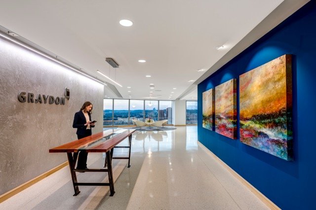
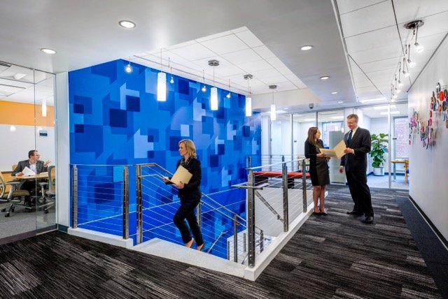
Stepping off the elevator and entering the reception area of Graydon’s rebranded office space evokes a similar reaction from clients and guests alike, “Wow this doesn’t feel like a law firm!”
We invite you to follow Kolar’s journey in creating a new Graydon brand, and transforming the customer experience within their new offices.
In May 2014, Graydon’s ‘Committee on the Future’ challenged their Chairman, Tom Prewitt to create a legacy of change. Within the firm, Tom has always been one to embrace change, and this promised to be his biggest challenge. Fortunately, Tom believed in the power of design. He understood the importance of experiences and he knew, for the firm to remain relevant, change was imperative. He wholeheartedly embraced the concept of transformation as Graydon was about to step into a new era. Tom noted, “It was time for a transformation. It wasn’t about just a move to a different office but a larger transition, the opportunity to change the many things we’ve wanted to change over the years.”
The Graydon leadership team started the transformation by redefining their vision statement.
Greater Cincinnati’s most innovative and vibrant law firm, recognized by our clients as an indispensable partner, providing exceptional service and expertise.
This vision established Graydon’s progressive attitude and appetite for change. Kolar was then challenged to redefine the brand, setting a framework to:
-
Define the signature quality of Graydon
-
Build upon their most ‘innovative’ and ‘vibrant’ vision
-
Create a new identity, message platform and website
-
Reflect their important position within the Cincinnati community
-
Drive change in the overall Graydon culture
At Kolar, we place a heavy emphasis on the front end of our design process, spending time to discover and learn before crafting a successful design strategy. In our discovery work with the Graydon team we interviewed key stakeholders, conducted a survey with staff, and facilitated a design thinking workshop. We gathered 25 members of the extended Graydon team, representing a diversity of voices and generations, to help build a consistent brand foundation. The workshop was a full day, resulting in great insights which lead to creating a narrative we could all support.
The core idea encompassing the Graydon narrative is ’Connections’.
WE’RE WITH YOU
The most powerful relationships in life are built on authentic connections; where you know each other so well, you can anticipate what the other thinks and needs. You respect where each other is coming from because you’ve been through it together. You’ve experienced the joys, and the pain. At Graydon, we aren’t just legal service providers; we’re our clients’ constant counsel. We get to know our clients, their personal and professional experiences, so well in fact, we are truly partners. Our relationships run deep because we’re always there – sharing our knowledge, anticipating what lies ahead, navigating change, forging a way to the best outcomes.
For 140 years, Graydon has been an indispensable partner, building relationships with our clients, and the communities we serve. With deep knowledge, and even deeper empathy, we remain connected to you.
With our core narrative of ‘connections’ in place, our next objective was to create a comprehensive identity system. Our logo exploration ultimately lead to the use of ‘conversation boxes’. This graphic element is used to visually express how Graydon connects with their clients, colleagues and the community. The overlap of translucent elements is symbolic of the magic that happens thru Graydon’s connections. The resulting square becomes the geometric shape that forms the basis for the identity system.
-
Proprietary letterforms are simple but bold to suggest trustworthiness, strength and stability
-
Color palette uses timeless blues and grays with accents of fresh, vibrant greens and orange
-
Other assets include a variety of colorful and linear patterns
By this time, an office location had been chosen. Using the message platform and newly created identity system, we translated the brand into the physical environment.
We established the following goals with the Graydon leadership team for the new office space:
-
Provide a welcoming, authentic experience where every client need has been considered
-
Elevate the experience for clients, guests and employees, drawing them to the inspiring views of the city and river
-
Capitalize on the open, light-filled spaces with touches of texture, color and an edge of creativity
-
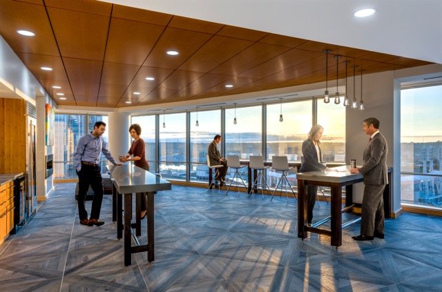
Optimize employee amenities to facilitate collaboration and provide opportunities for a casual break
-
Communicate the connection to our clients, our community, and each other while introducing the fresh, new Graydon brand expression
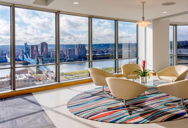
After exploring several concepts, the leadership team selected ‘Bridges’ as a metaphor for how Graydon connects to clients, each other and the community. ‘Bridges’ also provided the perfect avenue to bring the beautiful, expansive views of the Ohio River bridges into the space, bringing the iconic Roebling Bridge to our front door.
This collection of images depicts how the graphic assets have been integrated into the physical environment to tell the new Graydon story.
The entrance makes a statement about the new brand, introduces the identity and highlights the artful sophistication but, most importantly, draws guests to the amazing views of the river and bridges. The large ‘conversation space’ and café are meant to be open and welcoming. Even the reception table is designed to suggest the Ohio River and reflect the qualities of a bridge structure.
“Our space faces outward and that’s a metaphor for our people, we expect them to be out and in the community” (Tom Prewitt)
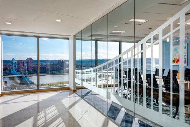
Subtle graphics of bridge structures link the inside to the outside.
Business cards offer a variety of printed backs (colors and patterns) to demonstrate innovation and to delight.
The ‘connecting stairs’ reinforce the theme and show the new graphic pattern.
A collection of story panels that reinforce the connections Graydon has to their clients, community and each other. These serve as an introduction to the personal stories you’ll find on the new website as well.
We hope you enjoyed our journey! ‘Thanks’ to the Graydon team for believing in the power of design. And, thanks to our many design partners for collectively delivering an ‘experience’ that is truly innovative and vibrant – and makes clients exclaim, “WOW, this doesn’t feel like a law firm!”
“One of the really pivotal, correct, decisions we made was, number one, to hire Kolar and number two, get them involved early in the planning process with Hixson and Cushman from day one and that has really turned out to be the right thing to do and you can see it now, you feel it in everything, the brand is really integrated well within the space.”
T. Prewitt, Litigation Partner and Firm Chair
For more information about Graydon, please visit www.graydon.law.
TEAM
Brand Experience
Kolar Design
Architecture/Interior Design
Hixson
Commercial Real Estate
Cushman & Wakefield
Construction
Hunt Builders Corporation
Fabrication
Site Enhancement Services
Photography
JH Photo
Posted in Brand Experience, Brand Expression, Branding, Built Environment, Corporate Workplace, Guidelines & Toolkits, Mixed Use Development


